
War Progression #1–4
After finding a great photo of a soldier walking down a road, completely loaded with gear, my brain started developing a loose narrative for him and his experience during the war. When I say "my brain" I'm referring to my subconscious collating a lot of the research I'd been ingesting and presenting me with ideas I still don't have a complete understanding of.
Is this one soldier's progression during the war? Is it a physical or psychological progression? Both? Does it represent soldiers in a broader sense? Is it the progression of the war itself? All wars? Is it my own psychological progress while spending nine months on this WWI painting project? These paintings could represent all of those, and any "interpretations" I offer would only be retroactive; as much as I "planned" the compositions, colours, and techniques used in them, they weren't as consciously planned out, metaphorically or symbolically, as, say the three paintings of Toys or Hangin' on the Old barbed Wire (among a few others).

Initial drawings.

Photoshop tests.
The ideas my brain presented were these: #1 would be rather straight-forward; #2 would have a double image and a cut in the canvas which I stitch up with red thread; #3 would be utter chaos, stylistically; and #4 would be serene but moody with a stark white background. I tried these concepts in Photoshop to see if I liked any of those "directions" from my brain.

War Progression #1
20" x 16", oil on canvas, 2014
The straight-forward one; a brown background instead of green for better contrast. Ring on right hand unpainted, and a slash across his left leg, both showing the orange acrylic ground I use in almost all my oil paintings.

War Progression #2
work in progress

War Progression #2
work in progress

War Progression #2
work in progress

War Progression #2
work in progress

War Progression #2
20" x 16", oil on canvas, 2014

War Progression #3
20" x 16", oil on canvas, 2014
I looked at a lot of different stuff, but my mind kept coming back to Jean-Michel Basquiat and his distinctive work. In the Photoshop test I ganged up a few of his paintings in various layers to get a feel for it and to see if it would work. Then I made up a composition in Basquiat's style but appropriate to my project. I was very satisfied with the result and this painting emboldened me to try other artists' styles (where appropriate) to diversify the story-telling in the overall project. It also helped me learn a lot about painting, trying to figure out how others did their work. Exciting!

War Progression #1 & #4
initial drawings (comparison)

War Progression #4
work in progress
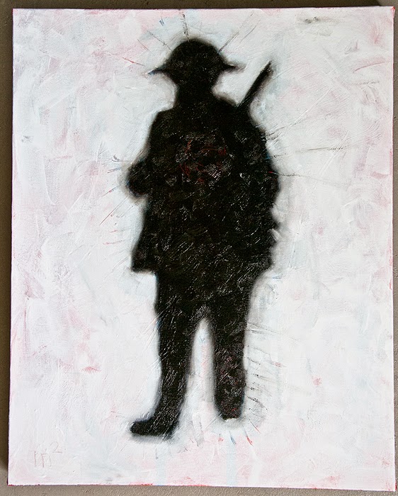
War Progression #4
work in progress
In comes the white oil paint after the blackness on the figure. I wanted something dark and textural, and for inspiration I was predominantly looking at the cover of Peter Gabriel's Passion album:

"Study for Self Image II" by Julian Grater
I didn't mix as many media for my painting as Grater had for his (charcoal, bitumen, graphite, pastel, acrylic, beeswax, dry pigment, straw, and flower petals on paper), and mine's not quite as nuanced, but I knew it had to have a similar feel.

War Progression #4
20" x 16", oil on canvas, 2014
In the end I swirled the back end of my brush in the soldier's chest, revealing a tangle of red spirals, and scratched at the left leg, revealing red lines. Dripping water onto the leg made the paint run a bit, creating the trails.
Comments