Seven decades after Kirk.
I'd been hooked on Star Trek since I was a wee lad in the 1970s, watching reruns of the original series from the '60s, and I enjoyed the movies that came out afterward. When a new series was announced to debut in 1987, I was excited and interested, even though I felt the subtitle "The Next Generation" was cheesy. Nearly 30 years later, I've definitely gotten used to it (but "TNG" is easier to say and type), but I still find it kinda bland.
Anyway, the show had fresh new technology and a spanking new design for its main ship, the
U.S.S. Enterprise, NCC-1701-D, now the flagship of the Federation.
Andrew Probert's design took some getting used to for me; it had the same basic elements of the original
Enterprise (saucer, neck, cylinder, and two cylindrical engines on pylons), but the shapes and volumes were distributed differently, weirdly. Everything looked squished and soft. The organic look of this new ship had me staring at early photos, trying to figure it out, and when the show aired, I tuned in every week, still trying to wrap my head around it.
Box art with tangents
First issued by AMT/ERTL in 1988, I built this kit in either 1992 or '93. I finally got a good sense of the shape of the ship.
The tangents I mention above are the O and the N from "Generation" touching (not overlapping, but precisely intersecting with) the front of the saucer. A nudge here, a slight reduction is size there, and they could have been avoided.
Minimal build.
As with all of my starship models in the '90s, I didn't go very far with detailing them. I simply assembled the parts, glued them together, painted a few key bits, and applied the decals. No filling of seam lines, no aztecking...I didn't even paint the phaser strips! Luckily, the ship was molded in coloured plastic, saving me the trouble of painting the whole thing.
Holding up.
The decals on the D have held up much better than the ones on my
Voyager, on which the carrier film (but not the decals themselves) has yellowed over the decades.
Nearly nude.
The
Enterprise looks naked with only the decals adorning it; no painted aztec pattern (but you can see it in relief, molded into the kit), no painted phaser strips or escape pods (the larger square details), no windows cut out or drawn in. Bare. Plain...
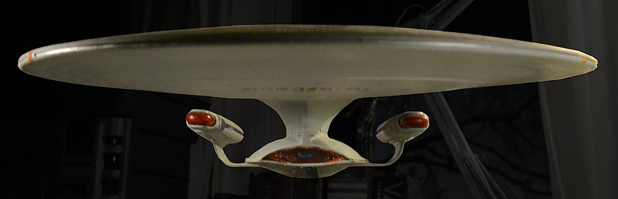
Top heavy.
Sometimes I see this design as extremely beautiful and elegant, and sometimes I think it's misproportioned and ugly. And from some angles, like this one, it looks silly, where I feel the
original Enterprise and the
refit both look nice from all angles.
The model itself is top heavy –especially since I attached the stand the wrong way! For over 20 years, the ship has been flying towards the ground because of this oversight (I've corrected the angles in these photos).
Ugh.
I still don't think I've grown to like the look of the main deflector and this angle of the engineering hull (it looks okay from the side and back). It doesn't help that my modelling skills were pretty crap at this point, this being only one of the first few I ever built. I mean, look at the crappy way I used a marker to draw in some of the windows. Jeez.
Nacelles.
Of all the flattening of this ship, I think the nacelles receive it the best. I painted the insides of the clear plastic parts (red and blue) with acrylics which seemed to work out okay. Would I light this kit if I were to build it today? I don't know, man...all those windows...
Looks good from the back.
I like this angle a lot, too.
This angle minimizes the enormous saucer section and makes the ship look very active. I'm sure we see it like this a few times on the show.
Nice profile.
This also minimizes the wideness of the saucer section and the overall design looks very well-proportioned. I also like the addition of the notch cutaway in the lower hull towards the back before the warp pylons, a Starfleet design hallmark that also shows up on the
Excelsior and the
Voyager.
Okay, fine.
Yeah, I sometimes think the saucer section is too big and ungainly, but I really like this angle, mostly because you can't see much of the rest of the ship, so the proportions don't look weird; just the saucer and the engines, really.
Look at all that great molded detail I failed to take advantage of!


Comments